What is WCAG
The Web Content Accessibility Guidelines or WCAG provides technical Mobile specifications to improve the accessibility of web content, websites and Improves support for touch web applications on desktop computers, laptops, tablets and mobile devices for people with a wide range of disabilities, including auditory, cognitive, neurological, physical, speech and visual disabilities.
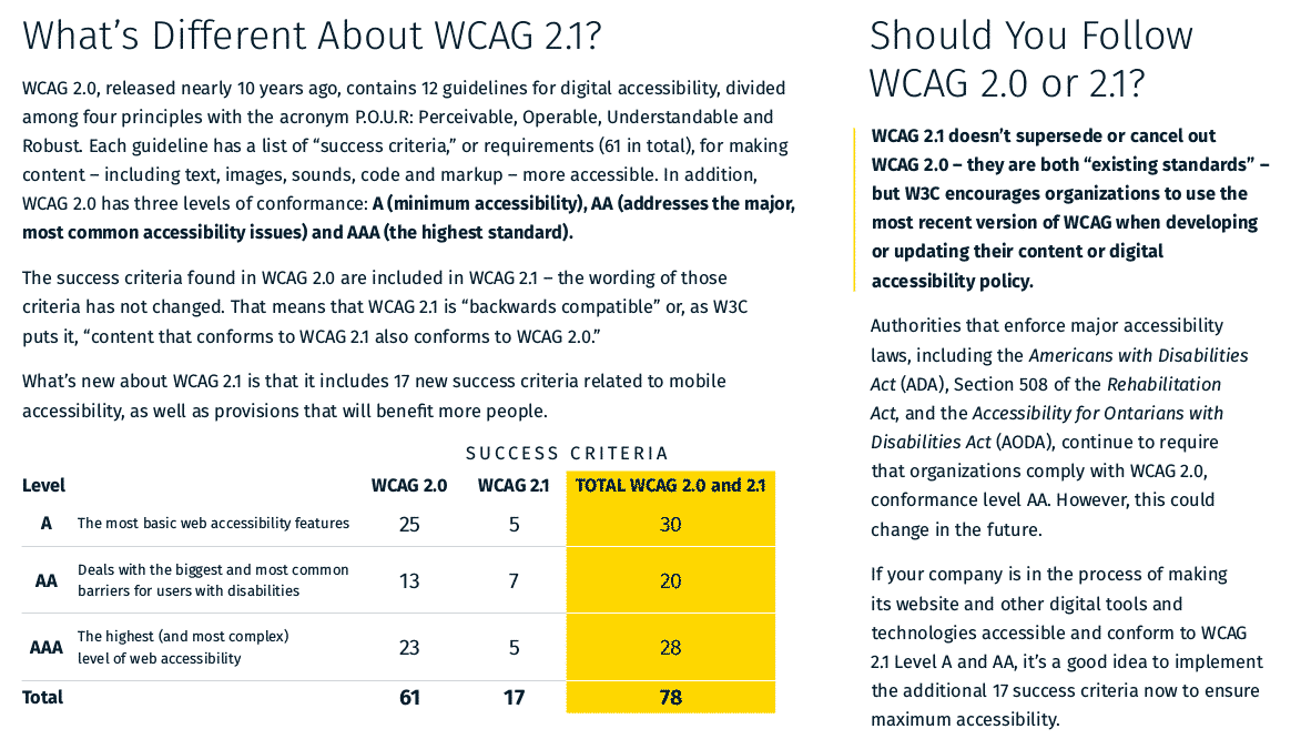
What’s Different About WCAG 2.1?
WCAG 2.0, released nearly 10 years ago, contains 12 guidelines for digital accessibility, divided among four principles with the acronym P.O.U.R: Perceivable, Operable, Understandable and Robust. Each guideline has a list of “success criteria,” or requirements (61 in total), for making content – including text, images, sounds, code and markup – more accessible. In addition, WCAG 2.0 has three levels of conformance: A (minimum accessibility), AA (addresses the major, most common accessibility issues) and AAA (the highest standard).
WCAG 2.1 Level A Checklist
Success Criteria Description
1.1.1 – Non-text Content Provide text alternatives for non-text content
1.2.1 – Audio-only and Video-only
(Pre-recorded) Provide an alternative to video-only and audio-only content
1.2.2 –Captions (Pre-recorded) Provide captions for videos with audio
1.2.3 – Audio description or Media Alternative (Pre-recorded) Video with an audio has a second alternative
1.3.1 – Info and Relationships Logical structures
1.3.2 – Meaningful Sequence Present content in a meaningful order
1.3.3 – Sensory Characteristics Use more than one sense for instructions
1.4.1 – Use of Colour Don’t use presentation that relies solely on colour
1.4.2 – Audio Control Don’t play audio automatically
2.1.1 – Keyboard Accessible by keyboard only
2.1.2 – No Keyboard Trap Don’t trap keyboard users
2.1.4 – Character Key Shortcuts Do not use single key shortcuts or provide a way to turn them off or change them
2.2.1 – Timing Adjustable Time limits have user controls
2.2.2 – Pause, Stop, Hide Provide user controls for moving content
2.3.1 – Three Flashes or Below No content flashes more than three times per second
2.4.1 – Bypass Blocks Provide a “Skip to Content” link
2.4.2 – Page Titled Helpful and clear page title
2.4.3 – Focus Order Logical Order
2.4.4 – Link Purpose (In Context) Every link’s purpose is clear from its context
2.5.1 – Pointer Gestures Users can perform touch functions with assistive technology or one finger
2.5.2 – Pointer Cancellation This requirement applies to web content that interprets pointer actions
2.5.3 – Label in Name The name contains the text that is presented visually
2.5.4 – Motion Actuation Functions that are trigged by moving a device or by gesturing towards a device can also be operated by more conventional user interface components
3.1.1 – Language of Page Page has a language assigned
3.2.1 – On Focus Elements do not change when they receive focus
3.2.2 – On Input Elements do not change when they receive input
3.3.1 – Error Identification Clearly identify input errors
3.3.2 – Labels or Instructions Label elements and give instructions
4.1.1 – Parsing No major code errors
4.1.2 – Name, Role, Value Build all elements for accessibility
WCAG 2.1 Level AA
1.2.4 – Captions (Live) Live videos have captions
1.2.5 – Audio Description (Pre-recorded) Users have access to audio description for video content
1.3.4 – Orientation Requires authors not to rely on a screen orientation
1.3.5 – Identify Input Purpose Ensure common names are provided using the HTML autocomplete list
1.4.3 – Contrast (Minimum) Contrast ratio between text and background is at least 4.5:1
1.4.4 – Resize Text Text can be resized to 200% without loss of content or function
1.4.5 – Images of Text Don’t use images of text
1.4.10 – Reflow Your website must be responsive
1.4.11 – Non-Text Contrast High contrast between pieces of text and their backgrounds
1.4.12 – Text Spacing Text spacing can be overridden to improve the reading experience
1.4.13 – Content on Hover Focus Ensuring content visible on hover or keyboard focus does not lead to accessibility issues
2.4.5 – Multiple Ways Offer several ways to find pages
2.4.6 – Headings and Labels Use clear headings and labels
2.4.7 – Focus Visible Keyboard focus is visible and clear
3.1.2 – Language of Parts Tell users when the language on a page changes
3.2.3 – Consistent Navigation Use menus consistently
3.2.4 – Consistent Identification Use icons and buttons consistently
3.3.3 – Error Suggestion Suggest fixes when users make errors
3.3.4 – Error Prevention (Legal, Financial, Data) Reduce the risk of input errors for sensitive data
4.1.3 – Status Changes Distances between paragraphs, rows, words and characters must be able to be increased to
a certain value

